One of the features in the Confluence 1.3 release that I still look back on and say "Hey, that's neat", is the representation of threads in the email archives. (For those not following at home, Confluence can now suck in and archive email, which is pretty useful if you're running a mailing-list and a wiki on related topics).
The idea for displaying threads this way isn't one I can really take much personal credit for. In a comment elsewhere on this blog, the author of Zoë (apparently the best mail app I've never quite got around to using) generously pointed me to this article by Jon Udell, which inter alia points out a massive flaw in most web-based mail archives.
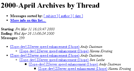
In most mailing-list archives that I (and Udell, it seems) encounter, threads generally look like this:

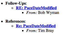
Worse still, the view you get of the thread at the bottom of each mail tends to resemble this:

These views impart (at best) the shape of a thread, its duration, and who contributed. They give no indication of the gist of the conversation, or which messages are worth reading.
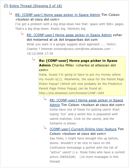
Where Udell was wrong, was saying that this was a problem inherent in email itself, and practically unsolveable. There's a pretty simple workaround, and it worked far better than I even hoped when I was implementing it. It turns out that if you grab the first substantial chunk of non-quoted text in an email, then nine times out of ten you'll get a good idea what that mail is about:

(The page that screenshot was taken from can be found here...)
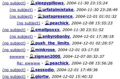
On a related note, here's an annoying User Interface misfeature from Livejournal. When you get sufficient comments on a page to overload the threaded comment view into summary mode, here's what it looks like:

Whenever I want to take the most obvious action for a comment (viewing it), I inevitably click on the most prominent link... which in this case is the username of the person who made the comment. This link takes me to that user's livejournal homepage. Try as I might, I've never got used to this, and I keep ending up exactly where I don't want to go.
For the sake of completeness, here's how we handle threaded comment overflow in Confluence. Since comment threads are revealed in chunks, and there should already be sufficient information leading up to the overflow to let the reader decide if they want to see the next chunk, all the overflow does is give the reader some idea of how much they're missing:
![]()